Foundational Planning Reports
Web App, PDF, and Print for Financial Advisors
Foundational Planning is a product that provides goals-based planning in an easy-to-use, modular way. The product caters to those who have less complex planning needs or are new to financial planning. The product also provides a set of printable reports, meant to be takeaways for an end-investor after meeting with their financial advisor.
As Foundational Planning was a new product built on cutting-edge technology, it needed reports that were also built to leverage these new technologies.
The reports built for other planning tools were designed and built many years ago, and a refreshed look for both screen and page would help differentiate it.
Problem Statement
As a financial advisor who is new to planning, I want to present a simplified financial plan to my client after having used the Foundational Planning product, but the existing eMoney reports are not designed with the design aesthetic or scope of Foundational Planning. This makes me feel confused and frustrated as I would need to provide my client with information that may be too in-depth and not optimized for the information in the Foundational Planning modules.
My Roles
Product Design
UX Design
UX Research
Accessibility
Design Process
Discovery
Research
Ideation
Architecture
Wireframes
Mockups
Follow-up
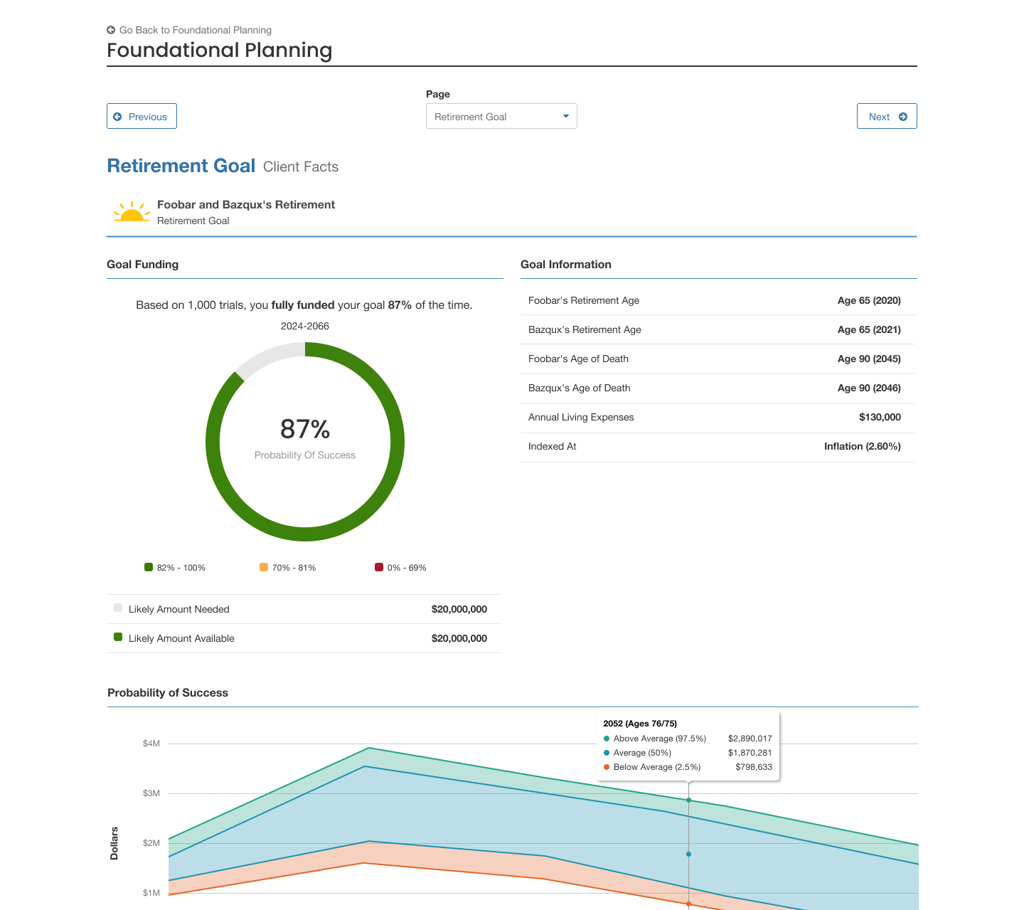
In order to create a presentation for a Foundational Planning client, I needed to first summarize the results and outputs of the Foundational Planning modules. In addition to the module outputs, I needed to figure out a way to compare the results of modules that represented a client’s current status with a proposed financial plan, and show the delta of the plan changes.
I knew that with Foundational Planning’s new approach and design philosophy, that its reports needed to reflect those improvements. To that end, I leveraged our user research team to conduct a usability study on the existing eMoney reports. I also wanted to understand what the most prevalent issues advisors faced when presenting reports to their clients, so using a combination of moderated interviews and unmoderated surveys, we were able to discover a large number of issues, the most important being an outdated look that did not meet ADA requirements for web or for printed documents.
After the results of the user research came in, my team and I knew we had a lot of work ahead of us. In addition to updating the look and feel, the biggest challenge was to create reports that contained a summary of outputs that were appropriate for the end-client, while still being in-depth enough that the advisor could use them to explain details of the financial plan. Most of the existing reports were in portrait mode, but our team decided early on that switching the reports to landscape mode gave us much more flexibility, allowing for larger charts and summary content.
Typically, a financial advisor would have a lot of leverage in which reports they wanted to present to their client, but this freedom also presented a challenge to advisors that were new to planning or eMoney products in general. To that end, I designed a version of the presentation building experience that would allow an advisor to see all the possible reports which could be contained within the final presentation, and toggle them on and off as necessary. To ensure that administrators and support personnel could properly troubleshoot a financial plan, this page also contained a way to view some reports that could not be viewed by the end-client.
Using a modular, component-driven design philosophy, I created a new takeaway presentation for Foundational Planning end-investors, which included branded cover sheets, customizable legal disclaimers, and reports for each module (or planning topic) within the Foundational Planning product. These reports were meant to both assess an end-investor’s current financial outlook as well as provide a plan of action to improve it. Therefore, many reports were designed in a way that would allow them to be reused in both contexts.
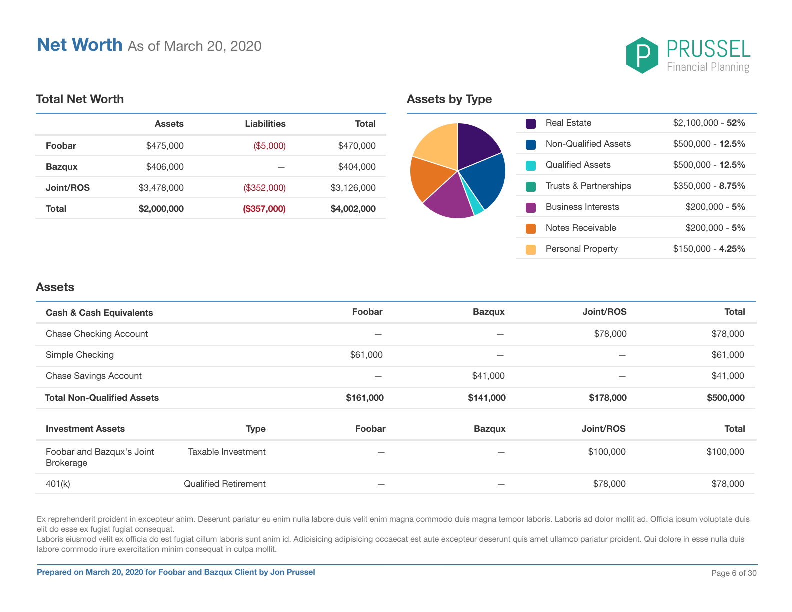

Adding to the challenge, these reports needed to be easily read and understood both on a screen as well as when they were printed out, as well as being compliant with ADA requirements. These reports featured new color schemes, type treatments, more easily digestible visualizations, and ADA-compatible tagging and media descriptions. Using the Online version of the reports, the financial advisor could present to their end-client using a TV or computer screen, and then print out the same information as a take-home summary for their end-client to review and keep for their records.


The resulting presentation was well-received by financial advisors, who had been hoping for a refresh of financial planning reports for some time. The process of designing and coding this new presentation helped eMoney realize that a rewrite of the existing architecture was much-needed, as well as designing more summarized content in a “plan overview”. In addition, all new presentations at eMoney are built with ADA compliance in mind, which I oversaw and documented with these reports.
This financial planning document was one of the first projects that I oversaw end-to-end throughout the entire design process, and allowed me to gain a much greater understanding of the process in which a financial advisor presents and explains a plan to an end-client. The project also empowered me to be a voice for accessibility, both in the reports space and elsewhere in eMoney’s products. This project kick-started eMoney’s commitment to providing an excellent visual experience for all of its users, which continues to this day.